Responsive web design is changing. Many websites still use old ways, with just fixed layouts for different screen sizes. But devices today are many, and users act in different ways. Because of this, designers start using AI to help websites adjust automatically. AI does not replace designers, but it helps them to learn users’ behaviour and change layout without waiting for manual updates. In 2026, responsive design is not only about grids and breakpoints. It’s more about layout changing with the user and the situation. Some websites try small AI features, but in the future, this will become more common and a bigger part of design.
What Responsive Web Design Means in 2026?
Before, responsive design was about screen width. If the screen is small, move the content down. If big, show in a row. This is simple, but not enough today. The same screen size can have different uses. Someone holds the phone one way, someone another way. The layout may look good in design, but bad in real use. In 2026, responsive design works with more information. AI looks at behavior and decides how the layout goes. Designers design for conditions, not only screen sizes. Sometimes the layout moves slowly or changes in unexpected ways, AI adjusts automatically. It may try different positions for content until it feels ok for most users. Sometimes changes are small, sometimes bigger, depending on the user.

Still Using Old Responsive Layouts?
Discover how AI-driven layouts adapt to real user behavior, not just screen size.
Why Is AI Changing Responsive Web Design?
Manual design can only guess what the user needs. Many times, assumptions are wrong. AI looks at what users really do. It sees patterns over time and changes its layout by itself. Designers still decide the main structure, but AI adjusts small things. When spacing is wrong or the text is too big, AI notices faster than a human. The website feels more natural and easier to use on different devices. Many small problems are fixed automatically. AI notices small things humans may miss, like text overlap or an image too close.
How Expert Designers Use AI?
Expert designers use AI in the following ways to make a website automatic and responsive.
1. Layout Adjustments
AI adjusts the layout of the screen by itself. This saves designers time as they do not need to adjust spacing, grids, and other elements manually. For example, if an image is too large for a mobile screen, AI automatically adjusts it according to screen size. This makes the layout better. Designers can overview these changes and track their performance.
2. Smart Breakpoints
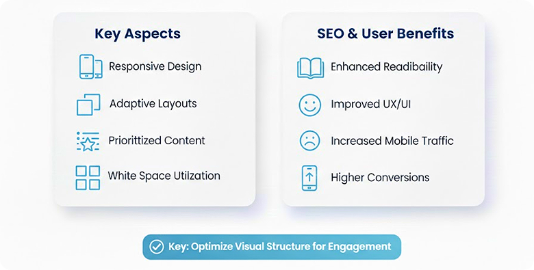
Old breakpoints only use screen width. But not enough. AI can use screen size, orientation, speed of scroll, and how the user touches. The layout may change early or late depending on the user. Designers decide the main layout, and AI decides when to change. The transition looks smooth and not mechanical. AI also detects new devices or unusual screen sizes and adjusts breakpoints slowly.
3. Content Priority
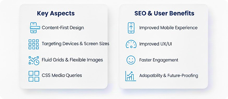
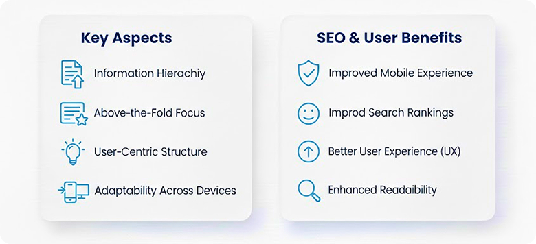
Not all content looks the same on a small screen. AI shows the interface of the website based on user behavior. Designers give instructions to AI for a customized layout. This makes the website more flexible for users, and they see the main sections of the content first.
4. Performance Help
The website must load fast, too. AI watches images, scripts, and layout. If the page is slow, AI reduces complexity, scales the image, and delays some elements. Designers don’t need to optimize manually every time. The website runs smoother and adapts better. Over time, AI finds parts of the page always slow and fixes them automatically. This helps the website stay fast on old devices too. Sometimes the fix is small, sometimes bigger, depending on the situation.

Fast, Adaptive, and Low-Maintenance Websites
AI keeps your site responsive, fast, and optimized without constant manual fixes.
Role of AI in Responsive Design
The user may face problems like small buttons, text hard to read, and layout issues. AI notices these and fixes spacing, size, and contrast. Accessibility, visual consistency, alignment, to reduce maintenance, and help the website feel steadier. Sometimes AI makes small mistakes but corrects itself later. It also makes the website easier for users to use without having to check every time. The layout feels smoother and more steady over different devices.
Future of Responsive Design in 2026
Predictive Layout
Websites may predict what users do. The layout can change before the user touches. AI uses past data to decide. Not perfect, but it reduces the problem. Pages feel stable and smooth. AI may try different arrangements first and see how users interact. Then it keeps a better version automatically. This makes the response more intelligent than only the reaction. Sometimes AI changes slowly, sometimes fast, depending on the situation.
Personalization Across Devices
The user may open the website on a phone and later desktop. The layout can change depending on the device. But visuals look the same, brand same. Adaptation keeps consistent and better experience. Sometimes AI shows different content orders for phones or tablets. Still keep the main content, but change small things to feel better for the user’s device. The user may not notice changes, but experience improvement.
Ready to Build an AI-Responsive Website?
Get a custom design approach that adapts automatically to users and devices.
Conclusion
Responsive web design in 2026 is not about screen only; it’s about behavior and use. AI quietly adjusts the layout without constant human work. Designers set the main rules, and AI applies slowly with data. The website feels smooth, fast, and adaptive. Automation becomes normal, and manual fixing is less common. The website is ready for different users and devices. This new responsive way is normal and important for future websites. Professionals such as Mindcob Digital Marketing Agency help people make their website auto-responsive with AI.
Frequently Asked Questions
AI observes user behavior and changes the website layout accordingly to make the user experience better. It automatically adjusts font, Images, and content priority with screen size.
Yes, it’s still useful. But not the same old way. The screen width is only not wide enough. AI helps responsive design act to user behavior. The website can change its layout automatically. More flexible and ready for new devices.
Responsive design follows screen sizes mostly. AI adaptive design looks at the screen and user behavior. It can move content, change space, and size without manual change. Responsive only follows rules, AI adaptive can learn from users.